Eyelykit Studio

Eyelykit Studio

eyelykit studio

top 7
graphic design
lingo
you need
to know

if you run a photo booth business

Pixel Perfection:
Mastering Graphic Design for Photo Booth Brilliance

Running a successful photo booth business involves more than just having the equipment; it also requires a keen understanding of graphic design principles. As a photo booth owner, understanding graphic design lingo can be beneficial for effectively communicating with designers and your clients.

#7 - Resolution:

Refers to the number of pixels in an image. High resolution ensures crisp and clear prints. Understanding resolution helps you request or create graphics that are suitable for printing in photo booths. We use the term RESOLUTION when determining templates to use.

#6 - DPI (Dots Per Inch):

Refers to the number of pixels in an image. High resolution ensures crisp and clear prints. Understanding resolution helps you request or create graphics that are suitable for printing in photo booths.  Understanding DPI is essential when it comes to resizing and scaling images for different print sizes. Different printers may have specific requirements, and knowing the appropriate DPI helps you resize images without compromising print quality.

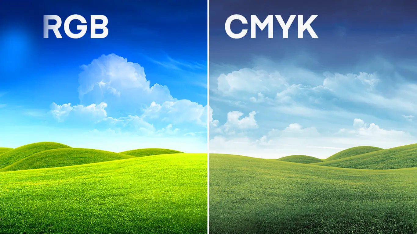
#5 - CMYK vs RGB

graphic design lingo RGB-vs-CMYK

RGB colors are additive, meaning they combine to create white. In contrast, CMYK colors are subtractive, meaning they absorb light and combine to create black. Understanding this difference is crucial to ensure that the colors you see on a monitor accurately translate to printed materials. If your photo booth business involves providing printed photos to customers, understanding CMYK is essential. Failing to convert RGB images to CMYK before printing can result in significant color discrepancies. Colors that look vibrant on a screen may appear dull or different when printed.  Generally speaking, RGB is brighter than CMYK.

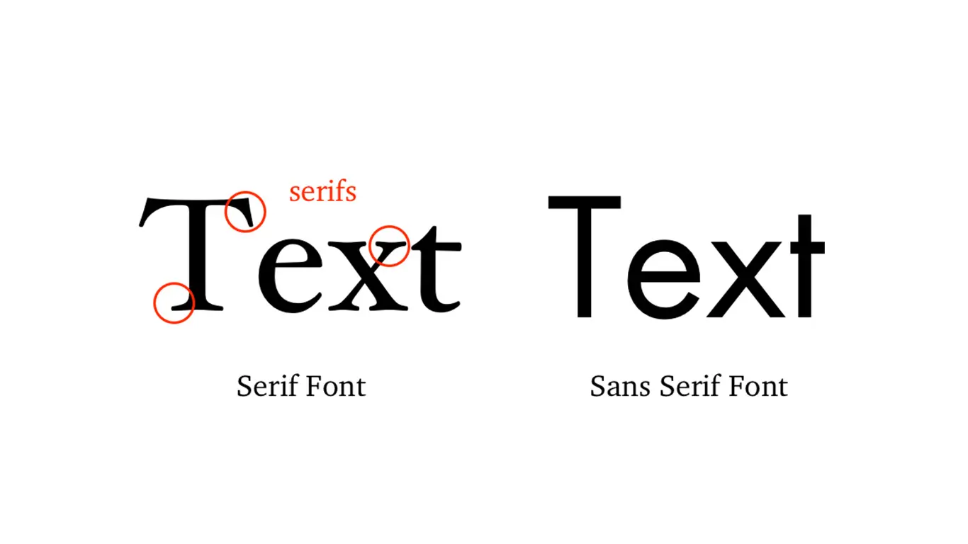
#4 - Serif and Sans Serif:

graphic design lingo serif-vs-sans-serif

Understanding the difference between serif and sans-serif fonts is important in various design contexts, including for a photo booth business. Here are some reasons why:  Serif and sans-serif fonts convey different tones and styles.  Serif fonts often have decorative lines at the ends of characters, which can enhance legibility in certain contexts. Sans-serif fonts, on the other hand, are often considered cleaner and more modern. 
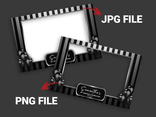
#3 - PNG vs JPG

graphic design lingo JPG-files-and-PNG-files

Understanding the differences between PNG and JPG file formats is crucial for a photo booth business for several reasons:  PNG:  supports lossless compression, which means no data is lost during compression. This format is ideal for images that require high quality and detail, making it suitable for photos with intricate details or transparency.  You need transparency for your overlay templates. JPG: Generally has smaller file sizes, making it more suitable for situations where storage and bandwidth considerations are crucial, such as when uploading images online or sharing them through various platforms. JPG Does not support transparency

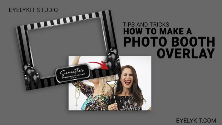
#2 - overlay / template

Using the term “overlay template” instead of words like “frame” or “border” in the context of a photo booth business is important for several reasons:  The term “overlay template” accurately describes the digital graphic or design that is overlaid onto the photos taken in the booth. Calling it a “frame” or “border” might imply a physical, tangible object around the photo, which could lead to confusion. Using industry-specific terminology demonstrates professionalism and a clear understanding of the photo booth business.

#1 - White Balance

Understanding white balance is crucial for anyone operating a photo booth business.  White balance ensures that the colors in the photos accurately represent the true colors of the subjects and the scene. Incorrect white balance can result in photos with unnatural or tinted colors, which may disappoint customers and affect the overall quality of the images. Clients are more likely to trust and value a photo booth service that demonstrates technical expertise. Understanding and managing white balance effectively adds to the overall professionalism of your business.

In conclusion, as a photo booth owner, familiarizing yourself with graphic design lingo is essential for effective communication with designers and clients, ensuring high-quality prints, and enhancing the overall visual appeal of your photo booth materials. To be professional you need to sound professional.

Eyelykit Studio

Your One-Stop Shop for Photo Booth Assets and Website Design

Welcome to Eyelykit Studio, where photo booth owners find everything they need to enhance their offerings and delight their clients. Explore our extensive inventory of overlay templates, animation screens, video effects, background videos, virtual backdrops, and Photoshop droplets designed to elevate your photo booth experience to the next level. Plus, discover our latest addition: bespoke website designs tailored to showcase your services and attract more customers. Whether you’re a seasoned professional or just starting out, Eyelykit Studio is your ultimate destination for premium photo booth assets and cutting-edge website solutions. Let’s make every snapshot unforgettable together!

0
    0
    Your Cart
    Your cart is emptyReturn to Shop